

When you're leading a practice, your dashboard stats are more than just historical data—they are a roadmap for your business's health, patient retention, and long-term financial predictability.
By learning to read the story behind the charts, you can move beyond day-to-day metrics and focus on what truly matters: transforming routine visits into lasting patient relationships.
The Payments Color Code: Mapping the Patient Journey
Your revenue graphs are broken down into three distinct colors. Understanding what these colors represent helps you see exactly where your revenue is originating and how well your patient care plans are converting.
🟢 Green (One-Time Payments): This represents collections from all single, one-time payments such as retail products, one-off adjustments, copays.
The "WHY": While green revenue boosts cash flow, it is transactional and unpredictable. A practice relying too heavily on green revenue faces high financial instability.
🟣 Purple (Auto-Debits with an End Date): This tracks recurring payments tied to a specific, finite care plan.
The "WHY": This represents your corrective-care flow. It provides excellent short-term financial predictability, but because it has an expiration date, the goal is to convert these patients to the next stage before their plans end.
🟡 Gold (Indefinite Auto-Debits): This tracks recurring payments scheduled indefinitely.
The "WHY": This is your Wellness Care goldmine. Gold revenue represents long-term patient retention, stable recurring revenue, and a thriving practice. Your ultimate goal is to see your gold bars grow steadily over time.
Visual Aids: How to Read Trends and Forecasts
The Running Average (Yellow Line)
Across your graphs, you will notice a consistent yellow line weaving through the bars. This represents your running average.
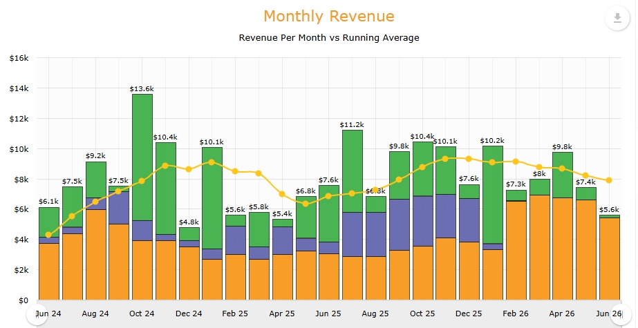
How to use it: Avoid focusing on isolated high or low months; instead, observe the overall direction (trajectory) of the yellow line. If it is dipping, it's time to evaluate your active patient retention.
Projecting the Future (30-Day & 12-Month Forecasts)
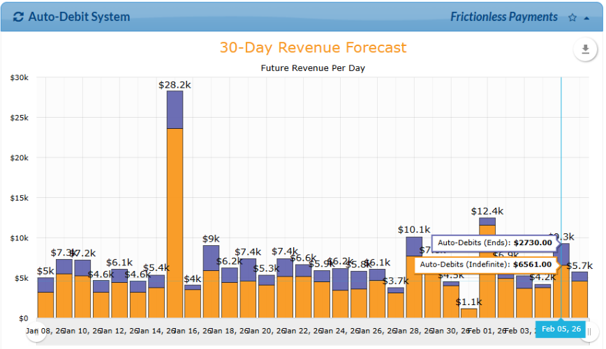
The Forecast Reports look ahead to show you exactly what your predictable revenue will look like based on your scheduled Auto-Debits.
The Missing Green: You will notice that forecast graphs exclude the green bars.
The "WHY": Forecasts are based exclusively on your stable, committed Purple and Gold auto-debits, establishing your absolute minimum guaranteed revenue.
Case Studies:
Yearly Revenue
The "Good" Report: Scaling Your Wellness Care
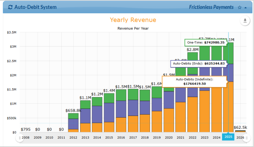
What you see: A real-life example of a High-Retention Success Model. In this chart, an active office demonstrates consistent year-over-year growth in their indefinite Auto-Debits (Gold), driving their total revenue to all-time highs.
The Interpretation ("The WHY"): This data illustrates the powerful transition of converting patients from active care (Purple) into ongoing wellness care (Gold). By establishing a highly stable and well-retained patient base, the business achieves exceptional financial predictability.
The Dynamic Shift: Watching the Gold bars expand year-over-year represents the compounding value of patient loyalty. Building this rock-solid baseline of recurring wellness revenue significantly lessens the strain of constant new patient acquisition (Green). Instead of restarting at zero every month, yesterday's clinical successes become tomorrow's predictable financial foundation.
12 Month Revenue Forecasting:
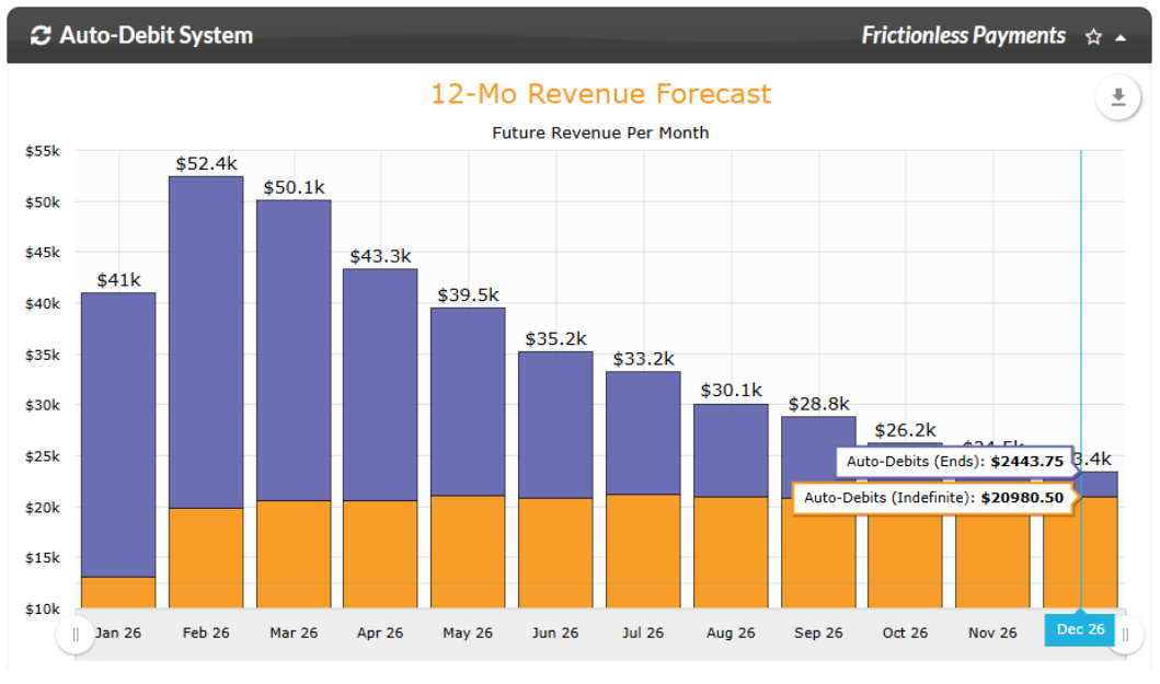
What you see: A forward-looking, month-by-month projection of your contracted revenue over the next year. You will see your Gold (indefinite wellness) revenue forming a solid baseline across the bottom, while your Purple (finite care plans) revenue naturally tapers down in the future months.
The Interpretation ("The WHY"): This forecast is a living, breathing crystal ball for your practice. Because it only tracks scheduled auto-debits, it shows you your guaranteed minimum baseline.
The Dynamic Shift: It is completely normal to see your Purple bars get shorter in the distant months—that simply represents patients reaching the end of their current active care plans. Your goal is to watch your Gold baseline trend higher over time. As patients "graduate" from active care (Purple) and transition into lifetime wellness, they move into the Gold tier. This means every month you look at this forecast, yesterday’s fading Purple plans should be converting into tomorrow’s growing Gold bars, while new patient sign-ups step in to rebuild your active care pipeline. It tracks the beautiful, continuous cycle of patient retention!
Your ultimate goal is to see your gold bars grow steadily over time as your purple bar trends down.
Daily Revenue
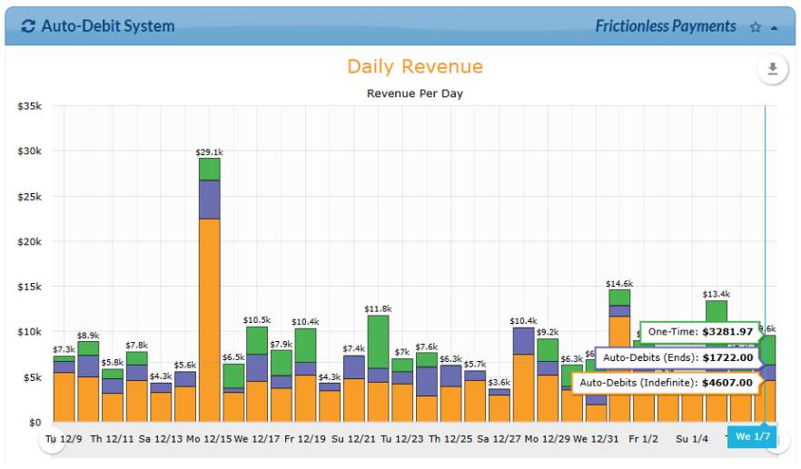
What you see: A fluctuating, day-by-day breakdown of collections showing vertical bars composed of Green (one-time payments), Purple (auto-debits), and Gold (indefinite auto-debits). Certain days show massive vertical spikes.
The Interpretation ("The WHY"): This graph tracks immediate, short-term cash flow. The high spikes typically represent irregular, one-time transactions like upfront care plan fees or retail sales. While this view is great for monitoring daily operations, it is easy to get distracted by day-to-day fluctuations. To see the true health of your practice, look at your monthly collections graph—the running average line there reveals your actual financial trajectory.
The Dynamic Shift: As your practice matures, your goal is to transition away from relying solely on these unpredictable daily peaks. By consistently converting one-time transactions into recurring wellness plans, you will notice your daily baseline naturally lift. You want to move away from an inconsistent daily cash flow model to a predictable, smooth revenue stream where daily spikes are just a bonus, not a necessity.
Monthly Revenue
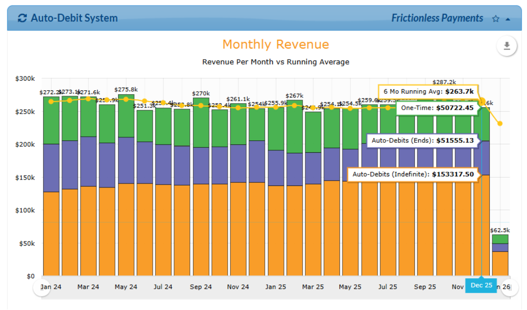
What you see: A month-over-month view of total collection revenue. A steady, golden-yellow line (the Running Average) weaves smoothly across the top of the monthly bars.
The Interpretation ("The WHY"): This is the ultimate health check for your practice’s monthly overhead sustainability. This view allows you to see if your core recurring revenue (Purple and Gold) completely covers your monthly expenses before you even factor in one-time payments (Green). Your goal is to watch the yellow running average line trend steadily upward, proving that your baseline revenue is scaling month over month.
The Dynamic Shift: When you first start tracking this, your monthly bars might look uneven due to seasonal shifts or sporadic patient sign-ups. However, as you build your recurring wellness base, the golden-yellow line will begin to smooth out and pull upward. The shift you are looking for is a decoupling from seasonal "dry spells." A rising running average means your practice is outgrowing its reliance on a constant influx of new patients, creating a self-sustaining business that grows reliably month after month.
30-day forecast
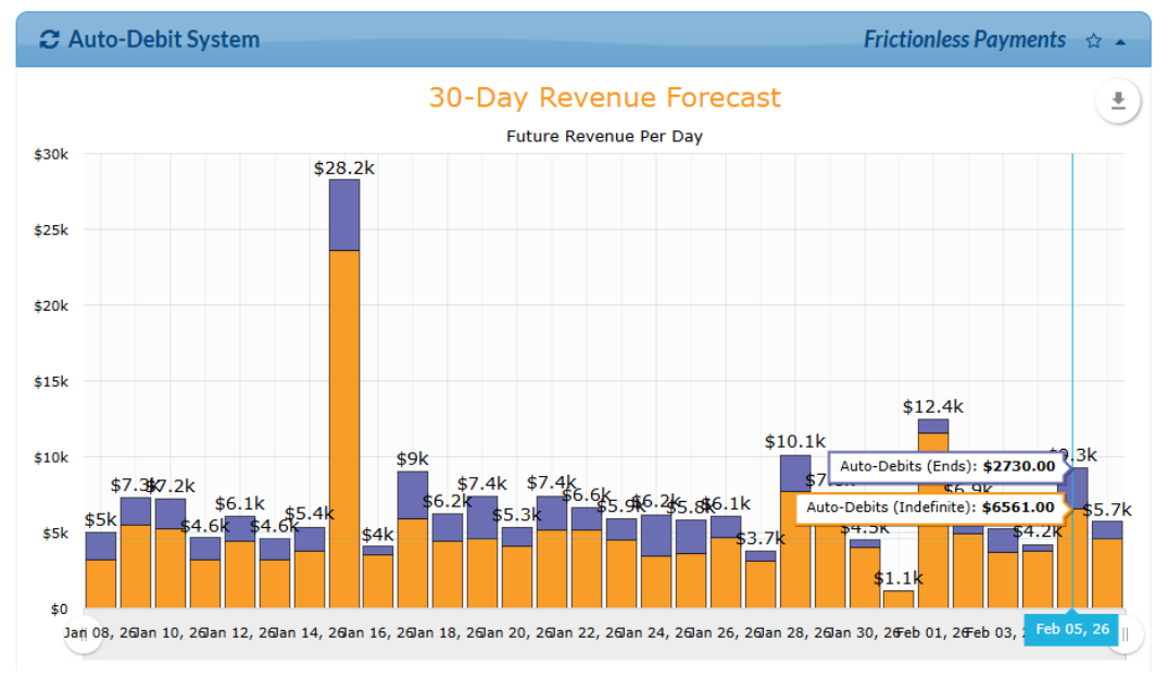
What you see: A forward-looking, day-by-day projection of upcoming revenue over the next month. The graph contains zero Green bars, displaying only Purple and Gold segments.
The Interpretation ("The WHY"): This report gives you an immediate, 30-day crystal ball into your cash flow. Because the system cannot predict spontaneous walk-ins or product sales, it completely strips out the Green revenue. What you are looking at is your absolute, guaranteed minimum baseline collections for the upcoming month based strictly on active agreements. It lets you know exactly what your scheduled payments are projected to collect.
The Dynamic Shift: The transformation here happens in your peace of mind at the start of every month. Initially, looking 30 days out might feel tight if your baseline doesn't fully cover your overhead. However, as your Purple and Gold agreements accumulate, you will watch this upcoming 30-day floor rise. The ultimate shift occurs when the total of these guaranteed daily bars surpasses your monthly operational expenses before the month even begins—mitigating the financial pressure of fixed overhead costs and allowing you to focus entirely on patient care.
Revenue History & Forecast
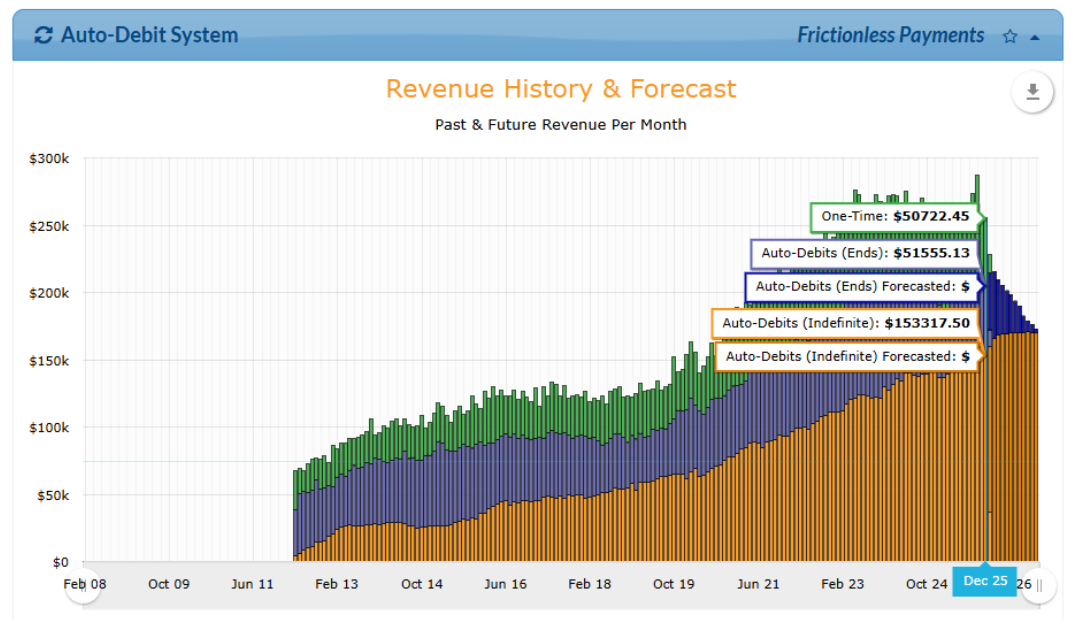
What you see: A massive, comprehensive timeline that merges past collection data with future revenue projections across a multi-year span. It introduces four distinct layers: Green, dark purple, bright purple (auto-debits ending soon), and a solid bedrock of Gold.
The Interpretation ("The WHY"): This is the "big picture" roadmap of your business's legacy. It lets you visually see where your practice was, where it is now, and exactly where it is headed. The massive value here is tracking the bright purple warning bars (plans ending soon). This tells your team exactly how many patients are approaching the end of active corrective care, giving you a proactive window to step in and transition them into lifetime wellness (Gold) before that revenue drops off.
Case Studies: The Million-Dollar Hamster Wheel (The New Patient Dependency Trap)
The "Cautionary" Reports:
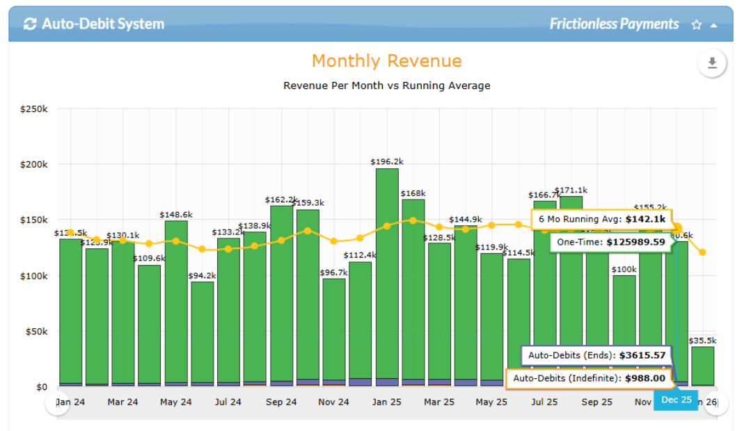
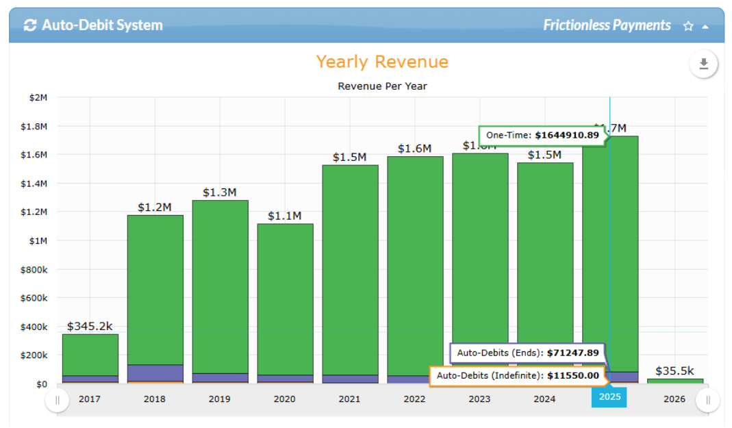
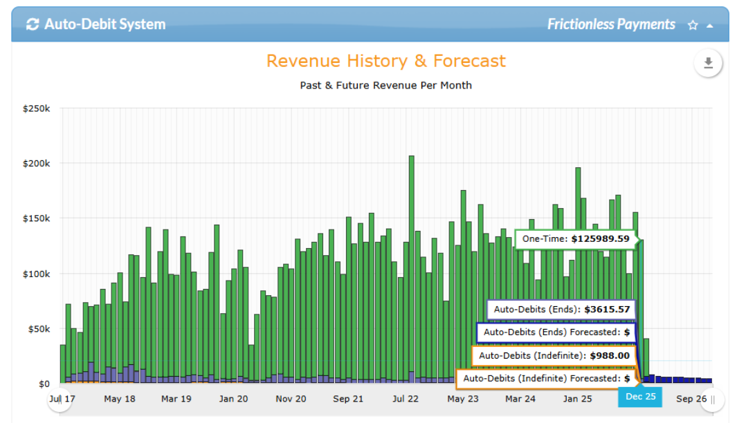
What you see: On paper, this office looks incredible—the total revenue bars are massive, showing a business pulling in over a million dollars a year. However, looking closer at the color breakdown, the Green (one-time payments) and Purple (care plans) dominate the graph, while the Gold (indefinite wellness) baseline remains completely flat and stagnant month over month.
The Interpretation ("The WHY"): This clinic is trapped in a high-income illusion. While they are highly successful at marketing and signing up a massive, constant flood of brand-new patients, they have a critical breakdown in patient retention. Because they fail to transition active care patients into lifetime wellness, they are forced to stay on a grueling financial treadmill.
The Vacation Test: An office that relies entirely on green revenue and the next "new patient" can never truly rest. If the doctor steps away for a few weeks or marketing slows down, the wheel stops turning and the income drops completely. Conversely, a practice that focuses on scaling their Gold wellness stats could literally take a month off from seeing new patients, and their bottom line wouldn't even feel it because their recurring auto-debits keep running quietly in the background. That is true practice freedom.
Step Off the Hamster Wheel & Build a Sustainable Practice
Chasing a non-stop flood of new patients is an exhausting way to run a clinic. Real, long-term stability happens when you stop focusing so much on top-of-funnel acquisition and start mastering the internal patient journey while guiding people smoothly from initial care into active, long-term wellness.
We map it out like this:
[New Patients] 🟢 GREEN ➔ [Active Care Plans] 🟣 PURPLE ➔ [Lifetime Wellness] 🟡 GOLD
Here is why this shift is a total game-changer for you and your practice:
Rock-Solid, Predictable Income: Imagine the peace of mind that comes with a business driven by steady, predictable monthly revenue. By focusing on your recurring Purple and Gold members, you build an ironclad financial foundation that takes the guesswork and stress out of your income.
Mastering Patient Retention: The secret to real growth isn't just bringing people in the door—it's inspiring them to stay. As your current Purple care plans naturally graduate into lifetime Gold wellness members, you create an incredibly loyal community of patients who value you for the long haul.
The Vacation Test: When your Gold base of long-term patients is thriving, your practice stabilizes beautifully. You officially pass the ultimate test—you can step away, take a vacation, and your income keeps flowing. You're finally off the marketing treadmill. New patient spikes (Green) stop being something you rely on to survive, and instead become pure profit and fuel for your next big goal.
How to Put Your Dashboard Stats to Work:
Numbers tell a story and understanding yours helps you stop chasing new patients and start maximizing your existing practice health. See how your Green, Purple, and Gold revenue streams connect, and learn how to turn your data into action.
➡️ Ready to take action? Read Dashboard Stats: Best Practices to Turn Data into Action.