
Example images below. Keep in mind that shapes will change depending on how many Biomarkers are measured
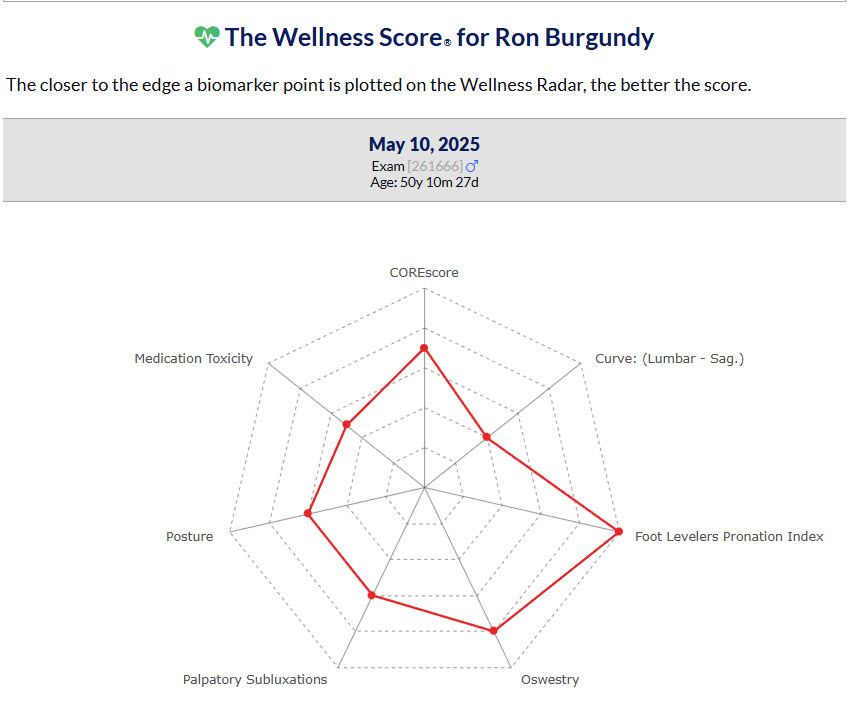
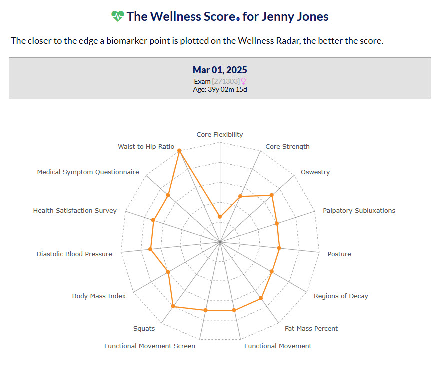
Here is how to read the personalized Wellness Radar:
1. Distance Equals Progress
Think of the center of the chart as "0%" and the outer perimeter as "100%."
Points near the edge: These represent the patient's strengths. They indicate areas where their body is functioning at its peak or ideal range for that individual biomarker.
Points near the center: These are the "growth opportunities." They highlight biomarkers with room for improvement.
2. The Goal of Symmetry
A healthy, resilient body is a balanced one. When we look at the radar, we aren't just looking for good scores; we are looking for symmetry.
An irregular shape (like the one in this example) suggests compensation—where one part of your health is working overtime to make up for a deficit elsewhere.
A symmetrical shape indicates that your systems are working in harmony, resulting in a more optimal Wellness Score.
3. Tracking Your Evolution
The beauty of this chart is that it adapts to what you are measuring. Whether you are measuring five biomarkers or fifteen, the goal remains the same: Expand the shape. As the patient progress through your care plan, we want to see that yellow line push outward in every direction until the radar is as large and balanced as possible.